Your website is usually the first real interaction someone has with your business — and first impressions online are brutal. Visitors decide within seconds whether to stay or leave, and no amount of great copy or clever marketing will save a site that's slow, confusing, or just unpleasant to use. The good news is that most of what makes a website work comes down to a handful of principles that are well understood and consistently proven.
This guide covers the fundamentals: UI and UX, responsive design, accessibility, and the design choices that actually move people to take action. Whether you're planning a new site or rethinking an existing one, these are the things worth getting right from the start.
UI and UX: Two Different Problems, One Shared Goal
UI and UX get used interchangeably, but they describe two distinct things. UI — user interface — is about the visual layer: the buttons, typography, color choices, icons, and layout. UX — user experience — is about how the whole thing feels to use. Does it make sense? Is it fast? Can someone find what they came for without thinking too hard?
A site can be visually beautiful and still drive people away if the experience underneath is frustrating. A checkout flow with too many steps, a navigation menu that buries key pages, a hero section that takes four seconds to load — these things erode trust faster than bad design ever could. The goal is for the visual design and the experience to reinforce each other: the UI should make the right actions obvious, and the UX should make following through on them effortless.
The most reliable way to improve both is user testing. Not assumptions, not best guesses — actual observation of real people trying to use your site. Tools like Hotjar for heatmaps and session recordings, or UserTesting for structured feedback, reveal friction points that are nearly impossible to spot when you're too close to the product. Even a handful of user sessions will surface patterns worth acting on.
Responsive Design Is No Longer Optional
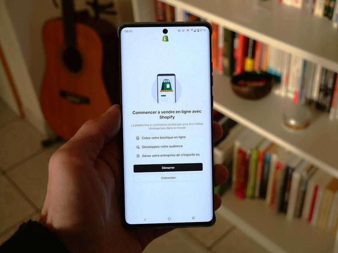
More than half of all web traffic now comes from mobile devices. If your site isn't designed to work well on a phone, you're not just providing a poor experience — you're actively losing visitors who will simply go elsewhere. Google also uses mobile-first indexing, which means your mobile experience directly affects your search rankings.
Responsive design solves this by building a single site that adapts fluidly to whatever screen it's displayed on, using CSS media queries, flexible grids, and images that scale appropriately. Done well, it's invisible — users on every device just experience a site that feels native to their screen. Done poorly, it creates the awkward "zoomed-out desktop on mobile" experience that everyone has suffered through at some point.
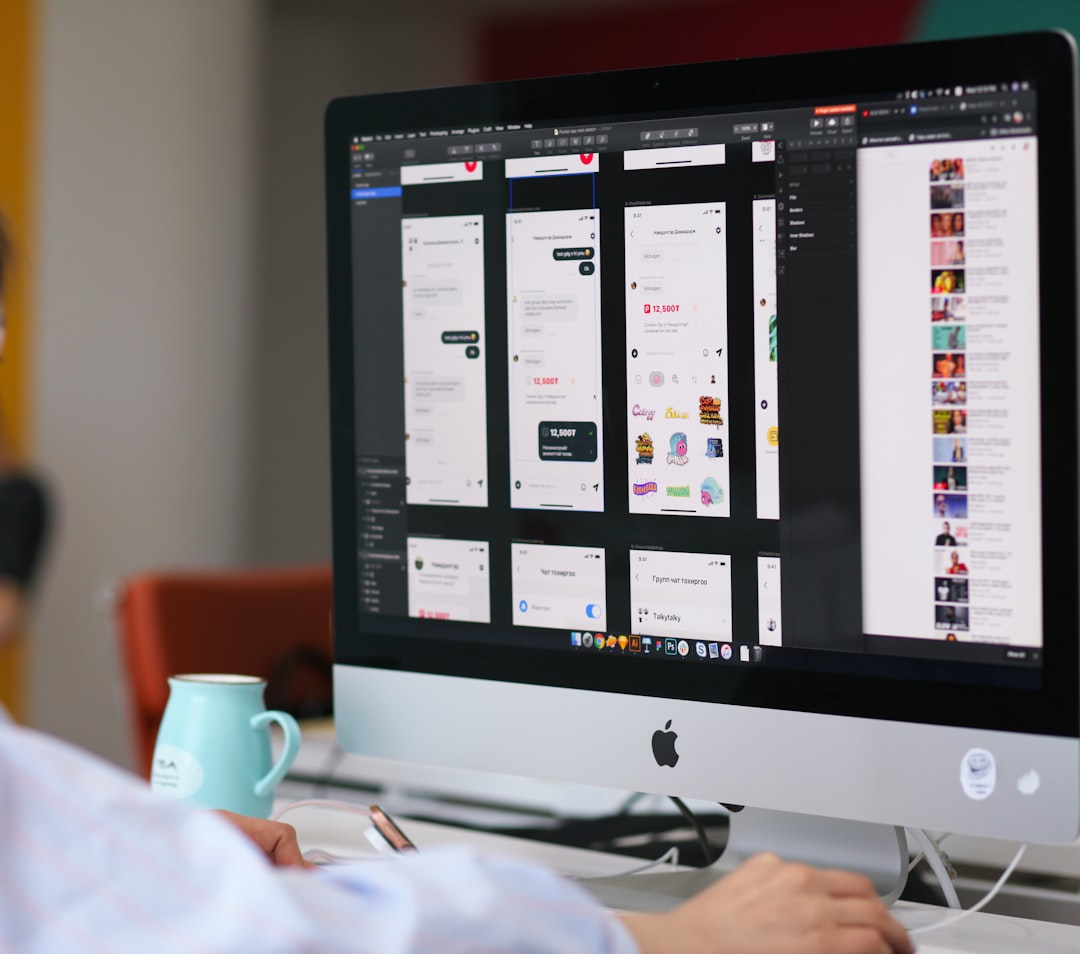
Design tools like Figma make it straightforward to design and test layouts across breakpoints before a single line of code is written. For teams that want to move faster, Framer builds responsiveness directly into its design environment. Either way, the key is treating mobile as a first-class design target, not an afterthought.
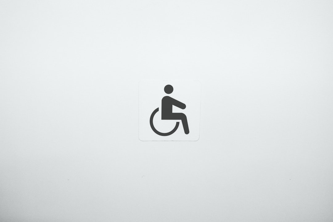
Accessibility: Building for the Full Range of Users
Accessibility is one of those areas where doing the right thing and doing the smart thing happen to be the same thing. Designing an accessible website means more people can use it — including the roughly one billion people worldwide living with some form of disability. It also means better SEO, since many accessibility best practices (semantic HTML, descriptive alt text, clear page structure) overlap directly with what search engines reward.
The practical checklist isn't long. Use sufficient color contrast between text and backgrounds — the WebAIM contrast checker makes this easy to verify. Write descriptive alt text for images. Make sure the site is fully navigable by keyboard. Don't rely on color alone to communicate information. Structure your headings logically so screen readers can parse the page.
The Web Content Accessibility Guidelines (WCAG) are the authoritative reference here, and aiming for WCAG 2.1 AA compliance covers the vast majority of what matters. It's worth noting that accessibility lawsuits have increased significantly in recent years — building to standard isn't just ethical, it's also practical risk management.
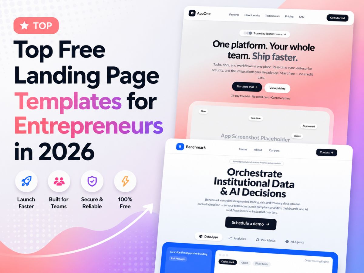
Design Trends Worth Following — and How to Use Them for Conversions
Design trends exist on a spectrum from genuinely useful to purely decorative, and it's worth knowing which is which. Minimalism has staying power because it's actually functional — fewer distractions means users spend more attention on what matters. Faster load times, cleaner navigation, more obvious calls-to-action. These are real outcomes, not just aesthetic preferences.
Bold typography has become a reliable way to establish visual hierarchy without relying on heavy graphics. When your headline does its job — communicating the core value proposition clearly and quickly — everything else on the page has a better chance of being read. Pair that with purposeful use of color to draw attention to key actions, and you have the basic ingredients of a conversion-focused layout.
The placement of calls-to-action matters more than most people realize. Research from Nielsen Norman Group consistently shows that above-the-fold content receives significantly more attention than content below. Primary CTAs — sign up, get a quote, start a trial — belong where they're immediately visible, not buried at the bottom of a long page. Test placement, test copy, and track what actually moves the needle using something like Google Optimize or VWO.
A well-designed website isn't a one-time project — it's an ongoing practice of observing how people use it and making it better. The sites that consistently perform well are the ones built on a solid foundation of UX principles, maintained to work across every device, accessible to every user, and refined over time based on real data.
At GemPixel, we design and build websites with all of this in mind. If you're starting from scratch or need to rethink what you already have, take a look at our design and software services — or go ahead and start a project with us directly.