When you do business in the Information Era, you get bombarded by vast quantities of information. You’re expected to make decisions based on said data. Also, you have to disseminate your understanding to your stakeholders, both internally to your employees and externally to your customers and investors.
Regardless of how good you are at processing information, there are hard human limits to how much you can take in, understand, and share. The same human limits apply to your employees, investors, and customers.
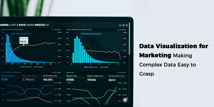
This is where data visualization comes in. It’s all presenting data visually, which makes it easier for the human brain to grasp. It allows people to take in and retain far more information in far less time. Internally, it allows you to make better business decisions. Externally, you can use data visualization for marketing to woo customers more effectively.
In today’s mini-guide, GemPixel explains everything you need to know about data visualization for marketing as well as in other business contexts.
What is Data Visualization?
Gartner defines data visualization as a way to graphically present data. It involves highlighting patterns and trends through visual objects to give readers valuable insights. It involves manipulating the objects’ color, shape, size, motion, and other attributes in an interactive manner. The objects used include charts, heat and tree maps, scatter plots, geographic maps, and similar.
The Dangers of Information Overload
The average American brain processed five times as much data in 2011 than it did in 1986, reports Fast Company. Unfortunately, our brains haven’t evolved to make sense of it all. Information overload is real and, after a point, you can’t pay attention to the data anymore, let alone retain it.
People are exposed to a massive 5,000 ads per day, says Clario. Your ad – regardless of how carefully you design your slogan, logo, and copy – is most likely to be background noise to the average person. Moreover, customers are generally more picky and cynical than they used to be. A catchy slogan won’t always be enough to engage them. It needs to be backed up by value.
Data Visualization is a Potent Marketing Asset
With strategic data visualization, you can give your marketing campaign an extra kick. It allows you to visually present key information about your company or product, making it easier for target customers to pick up and digest what you do. Instead of having to wade through reams of marketing copy or overdone slogans, customers can take a glance at an informative graph or chart and see what you do for themselves. They can derive their own conclusions.
Besides traditional marketing, data visualization also allows you to woo investors with pertinent information. For instance, you could present a graph about your steadily-increasing sales for the preceding few years.
Data Visualization Adds Value to Your Internal Operations
Besides your external efforts, data visualization can also aid your internal operations in various ways. Here are some examples:
-
Identifying trends: With visualization, it’s easier for you to make sense of vast volumes of data to gain key insight. For instance, you can analyze sales and marketing information to identify customer preferences and current market trends.
-
Make better choices: You can utilize your insights to make informed decisions. This includes setting up new business goals as well as troubleshooting existing problems. It allows you to personalize your marketing campaigns, streamline operations, and reduce your risk. You can put yourself in a better position too.
-
Presenting your findings to employees: You can share your insights with your employees and investors to put everyone on the same page. It’s convenient to share via PDF files because you can make changes to documents and drawings, and share conveniently, without having to print paper. Use a PDF editor to upload any file online, make changes, and download it back again.
Use Tools and Apps to Create Graphics Effortlessly
You don’t need to hire a graphics designer to create visual objects. You can use apps and software tools instead to make your own. This applies even when you have little knowledge of graphics or any artistic talent. Some of the top tools available include Tableau, Casual, Targetprocess, and Quire. You can also create basic graphics in an office utility app like Excel or Google Sheets.
Making visual objects is simple but choosing the right visual object to present your data optimally is less so. You have multiple options, from bar graphs and column charts to bubble charts and heat maps. It takes time, practice, and experience to choose the best option.
Conclusion
Data visualization can be well worth your time, whether it’s for marketing or internal business operations. You can use it to make sense of vast sets of data, make key business decisions, and thereby benefit your bottom line.
GemPixel helps you build your online presence with smart & beautiful websites, full-featured versatile applications and optimized SEO performance. Click here to get started.